Disconnected Space is a game that I made for the 2021 Game Maker's Toolkit game jam, with the theme "joined together". It's also a sequel to One side, one jump, which I made for the 2019 GMTK jam, and Orb, which I made for a different jam in 2020, although I intended for this game to be able to stand on its own and not require that you play the first two.
I recommend playing the game first, since this might spoil a few things.
Contents
Early ideas
Before the jam started, I was already thinking about maybe making a sequel to 1S1J and Orb, since I'd already made two games in the series, although I wasn't sure if I would actually do it since it would depend on what ideas I had after hearing the theme, and how well they'd fit in that series. I was also sort of thinking about maybe incorporating rainbows in some way, since it's pride month.
When I saw the theme, I had a couple ideas. The first was having two circles that were joined together by a line, and… I didn't really get much past that. The other was joining together different parts of space, which would fit in with 1S1J.
At first, I was thinking of making something that actually scrolled to follow the character, since in 1S1J you don't actually see space connected, you just wrap around the screen. I was also thinking of making it so that when you got to the right side of the level, it would stop scrolling, but when you collect the goal (which at this point I was thinking would be a star; I hadn't come up with the missing piece idea yet) it would start scrolling again and you could just walk to the next level, meaning that all levels were joined together. (Also this would sometimes destroy walls and portals that might be blocking your way, and in some levels maybe you'd fall down onto the level.) I decided these would be too complicated to implement in the short time we had, so I ended up instead making levels that were separate, non-scrolling screens.
I also had the idea that you activate two portals by connecting them together fairly early on, and I had a couple ideas for how that would happen. I was thinking at one point of having laser beams connect the platforms, where you can move around mirrors or make things block or not block the light; I went with wires instead, partly since that meant that I did in fact have something involving objects physically joined together. Part of the reason for the laser beam idea was that it would let me continue to have things be monochrome, since there would just be platforms and spaces in the platforms, whereas wires would need a different color to distinguish ground from the wires. Also, at first, I was thinking the pushable blocks would have wires inside of them; I decided instead to make the entire block conductive instead just to make things simpler.
Once I had the basic mechanics down, I had a few other ideas that I didn't use:
- Portals that make the screen wrap vertically in addition to horizontally. These would require more code to implement, and I decided to focus on other things.
- Portals that could either be pushed, or attached to pushable blocks. The game engine can handle portals moving even while they're active, but I just never got around to making these. (It would also mean that I'd have to handle the possibility that the player pushes the right portal to the left side of the left portal, or carefully design levels so that can't happen.)
- For a while I was thinking of having some sort of …not quite grappling hooks, but a swinging mechanic where you pass by a certain object and then connect to it and start swinging, giving an additional use of the "joined together" theme. I didn't get around to implementing it, and then decided it wouldn't fit in with what I had.
- When I was first programming the player character, I made her able to bounce (because she's a ball, sort of). The mechanic is still in the game, and you can still do it, but no level actually makes use of it. In the final version, you only bounce if you're holding the jump button; this is because of how I implemented a different feature where you control your jump height by holding down the jump button different lengths of time.
Color
The previous games in this series used a monochrome palette, with only two or three shades on one color on the screen at a time. In 1S1J, this was because of the "only one" theme; I often like to incorporate the theme in multiple ways, and one of the ways I did that was to have only one color per level. In Orb, it was for stylistic consistency with 1S1J.
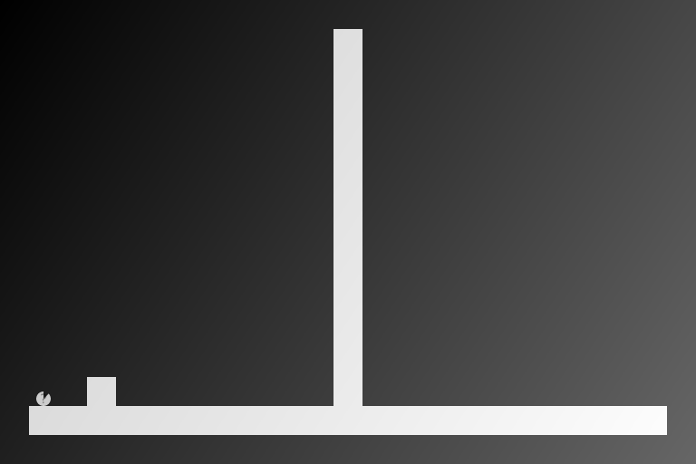
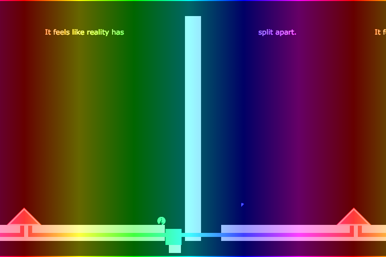
In this game, my initial idea was to have a gradient as a background and have a lighter version of the background gradient as the foreground. At first, the gradient was going to start out as a diagonal gray gradient, and when you activated a portal, it would change (with an animation) to a horizontal rainbow gradient, since the color wheel is cyclical, so the red on one side can line up with the red on the other side.


(Left: screenshot of the last version with the gray gradient. Right: screenshot of the final game, modified to show what my original gradient idea would have looked like.)
I ended up not getting around to the horizontal rainbow gradient thing, partly because at the time the background wasn't drawn separately for each copy of the world so I'd have had to calculate the gradient for the whole screen and that seemed like it would be a lot of work. I changed the gray gradient to be rainbowy because I didn't really like how it looked, and later I realized that the gradient not lining up sort of showed what was happening with the portals, so I decided to just keep that.
(Also, the reason the portal generators are red is because they would line up with the red part of the gradient in my original idea.)
Foreground objects use a lighter version of the gradient (which kind of makes them look semi-transparent white), but I quickly realized another problem. The way I drew the player involved drawing it at coordinate 0, 0 and then rotating, scaling, and moving it to the correct position (because that's the easiest way to deal with rotation), but because of how JavaScript handles transformations, the player ended up just being red (from the top-left of the screen) all the time. Therefore, I decided to just use different colors. I made the player green, because the Super Mario World orb that Orb was based on is green, and the first level of 1S1J is green, so green is the closest she has to an actual color.
(One unfortunate side effect of this is that a lot of colored objects are colors that colorblind people might have a hard time telling apart. I hope that's not an issue, since things are still different shapes.)
I also had problems deciding what color to make the active wires, since the first colors I tried (lighter gray and a light yellow) seemed too hard to tell apart from the platforms.
Story
The idea of the character having a missing piece came fairly early, and with it the idea that reality has fallen/is falling apart—things that should be joined together, aren't. The character has a question mark on her because of the previous game in the series, Orb, where it's a reference to the Super Mario World orbs, but I feel it fits in here too, for completely different reasons. One subtle thing that I'm not sure if people noticed is that the question mark slowly fades out over the course of the game. Another subtle detail is that platforms never actually touch each other, except the pushable boxes (which are affected by gravity) and platforms that are split apart by portals, because things have split apart.
Originally, I was going to have the short little story in the description be the entire story; the inclusion of text within the game was a fairly late addition, and I think I'd finished more than half of the levels by that point. (One consequence of this is that in the final jam version, the "The end" text is drawn in a completely different part of the code than anything else, since it was there before I decided to have text on all the levels.)
The story is loosely based on things that I've felt; for many years of my life I experienced something I think is derealization, which involved feelings that I don't exist and worries that at any point reality might just… stop existing, or something. There's also a bit of gender dysphoria mixed into the story (particularly in "Mirror"), since I suspect (but I'm not certain) that my derealization and gender dysphoria are related. Maybe also just general… uncertainty of stuff.
I do kind of feel like my ability to accurately express those feelings is somewhat limited by having to fit things into levels and mechanics that I'd already implemented, though.
Difficulty
The game is sort of a puzzle game, but a lot of the puzzles just have like two options, meaning that they can easily be brute-forced (although the last level will require some thinking). This is mostly because I'm not that good at designing puzzles, especially when I have a time limit; also a number of levels just exist to introduce a mechanic and don't really have much challenge at all. I worried that it would be too easy, but I got at least one comment saying that they liked that it was easy enough for them to figure out, so maybe the lack of difficulty is a good thing (or, at least, in the context of a jam, where not everyone who plays it is going to be into puzzles, and people aren't necessarily going to spend a long time on it).
Implementation
In all of my games, I've done all the code, including physics stuff, myself. On the one hand, this means that I had to start by writing a basic platforming engine (which I've done before); on the other hand, it means that I don't have to figure out how to get someone else's code to work with my weird portal idea.
There is only ever one copy of the player and one copy of the world. When a portal is active, that copy of the world is drawn multiple times with transformations applied (scaling and flipping) if necessary, with everything clipped except the player. The collision-handling code is run three times for the player, once for the real copy of the world and once for the copies to the left and right; in all cases, the effective hitboxes of the platforms are modified to be entirely inside the portal. Other objects are not affected by the portals.
If the center of the player's hitbox is past a portal, then the player will be teleported to the other portal and their size and orientation will be changed if necessary. The player's speed is multiplied by their size/orientation, meaning that the player will be going the same speed that their copy was going just before. You can see this in action in the post-jam version by pausing the game and pressing up, down, left, right.
Portals can be set to stretch the player in one dimension but not the other, but this isn't used in the game and is likely to have some glitches (I think there's some code somewhere that assumes that the player isn't stretched like this):
For determining whether two portals are connected, I just used a simple breadth-first search, looking for any conductive objects that are touching/overlapping any objects that I already know are connected to the portal I'm looking at, and I do this every frame. The same code is used for buttons, and there's no difference between button wires and portal wires. (There's at least one level where a button wire is colored as active when the button isn't being pressed, because it's connected to a portal.)
In every level, there's either only one left portal or only one right portal. The game doesn't care which portals are connected to which others, only whether a portal is connected to some other portal, so if you connected two different pairs of portals together, you could in some cases end up with the left portal from one pair leading to the right portal from the other pair.
This is I believe my first time making a game that has pushable blocks. The pushing block code I wrote has a couple bugs/limitations. For one thing, pushable blocks technically aren't solid from the side; this means that if you push a block into a wall, then you'll start to go through the block. This can happen easily in the first level (and if you do so, the portal won't connect, because the game thinks you're trying to push the block past the place where it needs to be to make the connection). The other main issue is that if you jump into the corner of the block at just the right angle, you'll end up being on top of the block and also pushing it.
Music
The version I submitted to the jam didn't have any audio. Part of that is because I prioritized other things, and part of that is because he said the majority of code should be written during the jam, and I had a big audio library already written that I would have used and I was worried it would end up being too much reused code (at least, when combined with the other reused code for things like keyboard handling).
At the time I'm writing this, I haven't yet released the version with music, so I don't know how people are going to feel about it. I tried to convey a sense of "something's not right", but I kind of worry if I did too good of a job at that.
Aside from "The end", all of the music is made using Shepard tones, sometimes repeating at intervals of 2 octaves or an octave and a fifth, and using tunings other than our standard 12-tone equal temperament (the number of notes per octaves varies by level). (Since I wrote my own audio code, I can do things like that.)
A lot of the sound effects are copied from earlier games in the series.
Other things
There are stars in the background, because the title of the game includes the word "space".
Post-jam updates
1.1
Some major things I changed in the first post-jam update:
- There's audio, which I talked about in the previous section.
- There's now an options menu (copied from my other games) and a level select menu (available after you play some levels in the post-jam version of the game). I didn't include this in the jam version because, like I mentioned in the "Music" section, I didn't want to use too much code from other games. The jam version had hidden cheat codes for skipping levels and for the option that's now labeled "Disable some graphical effects" (this was so if there were issues, I could put in the description or a comment "Press [whatever] if you're having this issue"); I've removed these, since those options are now available from the menus.
- I added a new level to the beginning, because a couple comments mentioned that they didn't realize you could jump (and I didn't realize that people might not realize that). I hope a level that's just two platforms with a pit in between adequately conveys that this game has a jump mechanic.
- There are a few levels where I moved things around a bit. The basic idea of each level is still the same.
- I added some graphics to the title screen, and slightly changed the animation for beating a level.
- I added some animation to the missing piece/goal. It's a bit subtle, but maybe it'll make it a bit easier to notice.
- I changed the portals' graphics when they're active.
- I wrote this commentary.

