Transcript
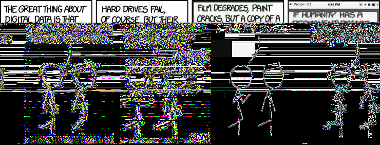
The top of the comic is readable.
Panel 1
Unknown character: The great thing about digital data is that
Panel 2
If you look close enough, you can see JPEG artifacts around the letters.
Unknown character: Hard drives fail, of course, but their
Panel 3
The border is thicker, and the JPEG artifacts are much more noticeable
Unknown character: Film degrades, paint cracks, but a copy of a
Panel 4
At the top of the panel is a cell phone status bar, showing "Verizon LTE" as the carrier, 4:45 PM as the time, and a few symbols and about half of the battery remaining. The text of the panel is somewhat blurred, in addition to the JPEG artifacts.
Unknown character: If humanity has a
Panel 5
The rest of the comic is super glitchy-looking. The background is mostly black instead of white, but with some random white stripes, and the panels are offset a bit to the right compared to the panels in the top part of the comic. Everywhere where there should be text is a mess of randomly-colored pixels. Some stick figures are visible, but they also seem to be made out of a mess of random pixels.
This panel has two stick figures; the one on the right is wearing a hat. The one on the left is talking. Below the feet of the characters is a mess of random pixels, and there are some random short dashes in the background, most of which seem to be green or blue, but a few of which are red or cyan.
Panel 6
The top half of the panel is even messier; I can sort of tell that there are still two stick figures, but I can't really make out their faces. The mess of pixels below the characters' feet is also still there, and the colored dashes are now much longer, and in part of the panel there's also what appears to be a grid of dots. These dashes now also include yellow and magenta.
Panel 7
This panel is much cleaner than the rest; the random pixels on the floor are gone, as are most of the dashes in the background, and I can easily make out the characters (they're the same as in the first panel). However, there are some longer white horizontal stripes in the background, and some other colors and a couple stripes that have some sort of weird gradient thing, and also a big white rectangle.
Panel 8
This panel is similar to panel 7, except that the characters are much less easy to make out and there isn't a big white rectangle.
Title text: ¢€ĒHf xnt b`n rd`d thhr, bnnfr`ttl`thnnr¢€“thd `rbhhvd xnt¢€™rd trhnf rthll jnnvr `bntt thd lntrdnvdr tdxt¢€
